#1 Qwen Image 3.0 vs Qwen Image 2 Prompt Guide (2026)
Qwen Image 3.0 vs Qwen Image 2, tested through X evidence: compare detail, text, Chinese layouts, speed, cost claims, and use four repeatable prompts.
 Qwen Image 3.0

The short answer to qwen image 3.0 vs qwen image 2 is uncomplicated: version 3 is the stronger image maker in the X comparisons supplied for this guide. It produces finer surfaces, follows complex prompts more reliably, and handles Chinese text and information-heavy layouts better. The uncomfortable part is that a sharper image can still be a wrong image. @teortaxesTex’s direct comparison, with about 62 likes and roughly 10,000 views at the time of collection, put it plainly: the details improved, but the scene did not necessarily make more sense.
That tension is the useful way to read qwen image 3.0 vs qwen image 2. If your work is posters, infographics, realistic materials, or long prompts, start with Qwen Image 3.0. If you need faster iteration or a workflow you already run locally, Qwen Image 2 may still earn a place. This guide shows how to test that decision instead of taking a launch montage on faith.
For the underlying layout method, keep the separate Qwen Image 3.0 Prompt Guide open. You can run the test prompts from this article on the Create page.
Generated editorial illustration for this article. It is not an authentic output pair from either Qwen model.
Qwen Image 3.0 vs Qwen Image 2: Method and Source Quality
This article uses the X snapshot supplied on July 23, 2026. Direct same-prompt comparisons receive the most weight. Product observations and multi-model rankings add context. Claims about price, speed, and access are attributed to the person who posted them because those conditions can change.
| X source | Public signal in the supplied snapshot | What the post can support |
|---|---|---|
| @teortaxesTex | About 62 likes, roughly 10k views | Direct 2 vs 3 image: detail improves; semantics may not |
| @Whoknowwwww | Four same-prompt scene types | Chinese text and instruction following improve over 2 |
| @imboomu | Product-side observation | 3.0 Pro looked much better and ran about 20% slower |
| @cedric_chee | Multi-model typography comparison | Text artifacts fall, typography still trails GPT-Image-2 |
| @chuyouqi | Character/reference-sheet ranking | Qwen Image 3.0 ranks ahead of Qwen Image 2 |
| @Maximus_W3 | Structured feature table | Community-reported token and price comparison |
This is not a lab benchmark. The dataset does not provide seeds, complete generation settings, a fixed sample count, or a blind panel. It is still useful because several people ran adjacent tests and reached the same broad result. Where they disagreed was not whether 3 beats 2. They disagreed about how close 3 gets to other frontier image systems.
Qwen Image 3.0 vs Qwen Image 2 Features: What Actually Changed
The community discussion around qwen image 3.0 vs qwen image 2 clusters around six practical differences.
| Feature | Qwen Image 2 | Qwen Image 3.0 | Evidence-based reading |
|---|---|---|---|
| Fine detail and realism | Good natural light and eyes were praised | Stronger micro-detail, materials, and realism | The most consistent upgrade |
| Prompt adherence | Adequate on shorter scenes | Better on dense, explicit instructions | Supported by Chinese four-scene and reference-sheet tests |
| Text rendering | More artifacts and blur | Fewer artifacts; small text is more legible | Major gain, but typography is not flawless |
| Chinese and complex layouts | Less stable | Better posters, covers, and infographics | A standout reason to upgrade |
| Speed | Faster in user reports | Slower; one report estimated about 20% | Important for high-volume iteration |
| Access | Familiar older workflows | Launch discussion centered on cloud/Pro access | Check current product access before planning a pipeline |
@Maximus_W3 also posted a table describing 500 versus 800 tokens and approximately $0.02 versus $0.03. Those figures are useful as a record of what one observer saw, not as a pricing promise. API names, quotas, and billing can move faster than an article can.
Qwen Image 3.0 vs Qwen Image 2 Detail Test: Sharp Is Not the Same as Correct
@codeRunnerUK singled out liquid metal as the kind of material where Qwen Image 3.0 felt like a different class. That makes reflective material a good test: it exposes micro-texture, surface tension, light direction, object count, and reflection logic in one frame.
Use this same prompt in both versions:
Photorealistic macro product photograph on a worn industrial workbench.
Exactly four objects: one shallow steel dish, one matte ceramic cube inside
the dish, one glass pipette to the right, and one folded charcoal cloth behind.
A single pool of mirror-bright liquid metal flows over the cube with realistic
surface tension. One soft window light from upper left; one cool rim light.
Keep reflections physically coherent. No extra tools, text, logos, or people.
Landscape 3:2.
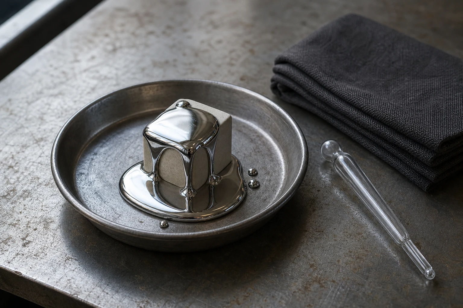
Generated target reference, not a Qwen Image 2 or Qwen Image 3.0 benchmark output.
Do not stop at “which one has more texture?” Count the objects. Check whether the metal reflects the window from the correct side. Look at the cube corners beneath the liquid. A comparison that judges only crispness will reward an attractive semantic failure, the exact concern raised by @teortaxesTex.
Qwen Image 3.0 vs Qwen Image 2 Text and Chinese Layout Test
Text is where qwen image 3.0 vs qwen image 2 becomes most useful for working designers. @cedric_chee reported that the obvious text-rendering artifacts were mostly gone in 3.0, while the typography still felt average and remained behind GPT-Image-2. @Whoknowwwww tested a technology cover, Chinese-style poster, realistic still life, and Chinese infographic with the same prompts. Their conclusion was a clear gain over 2, especially in Chinese generation and instruction execution, while visual taste, detail, and physical consistency still had room to improve.
The fair test is exact and short:
Vertical 4:5 Chinese technology exhibition poster.
Deep ink-blue paper, subtle topographic lines, one cobalt glass sphere.
Text exactly once:
"真实细节"
"中文排版"
"提示词执行"
"视觉实验 03"
Large headline in the upper third; three small information blocks at bottom.
Render no other readable text. No logo, QR code, or watermark.
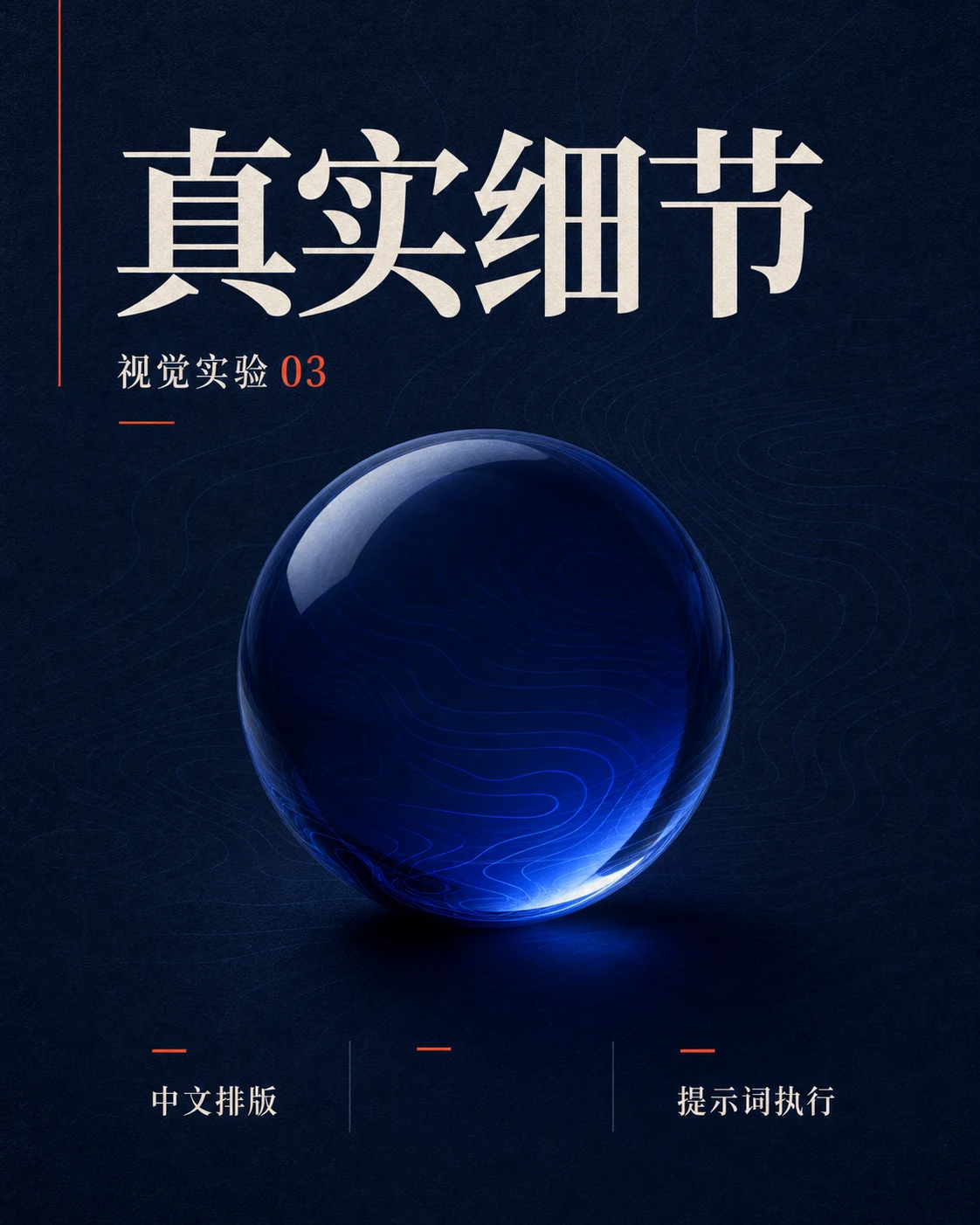
Generated target reference. Audit every character; the image is not presented as a model comparison.
Score character accuracy separately from typography. A model can spell every character correctly and still produce weak spacing, inconsistent type weight, or a title that collides with the image. That is why “text rendering” needs at least two columns in your score sheet.
Qwen Image 3.0 vs Qwen Image 2 Tutorial: A Fair A/B Workflow
A casual test changes the prompt after one model fails and then compares the improved result with the other model’s first attempt. That tells you nothing. Use this four-pass qwen image 3.0 vs qwen image 2 workflow instead.
1. Freeze the generation contract
Use the same prompt, aspect ratio, seed when both interfaces expose one, and output count. Disable hidden style presets if possible. Save the first result with a timestamp.
2. Isolate one failure mode
Run separate prompts for material detail, spatial logic, exact text, and repeated-character consistency. A single crowded “do everything” prompt makes diagnosis impossible.
3. Score before choosing a favorite
| Criterion | Points | What to inspect |
|---|---|---|
| Prompt adherence | 0–5 | Every required and forbidden element |
| Semantic coherence | 0–5 | Counts, relationships, anatomy, reflections |
| Typography | 0–5 | Exact characters, hierarchy, spacing |
| Detail and realism | 0–5 | Texture, edges, lighting, material behavior |
| Latency and workflow | Record only | Seconds, retries, access friction |
Do not merge these scores. A 5 in detail and a 1 in semantics is a specific failure, not an average-looking 3.
4. Revise only the failed instruction
If an output duplicates an object, strengthen the count constraint. Do not simultaneously change the style, lens, palette, and layout. One targeted edit shows whether the prompt is repairable.
Qwen Image 3.0 vs Qwen Image 2 Use Case: Semantic Composition
The generated reference below gave me a useful reminder while preparing this guide. My first prompt asked for one brass key visible through a carafe. The first image produced one key inside and another on the table. I removed only the duplicate. That is the sort of mistake a “more detailed” score never sees.
Editorial still life on pale limestone, eye-level, landscape 4:3.
Exactly three objects:
1. one transparent blue glass carafe, half full of water;
2. one red pear positioned behind the carafe;
3. one small brass key resting at the bottom inside the carafe.
The pear refracts naturally through the glass and water.
No duplicate key, extra fruit, floating objects, text, logo, or watermark.
Soft north-window daylight. Keep all shadows and reflections plausible.
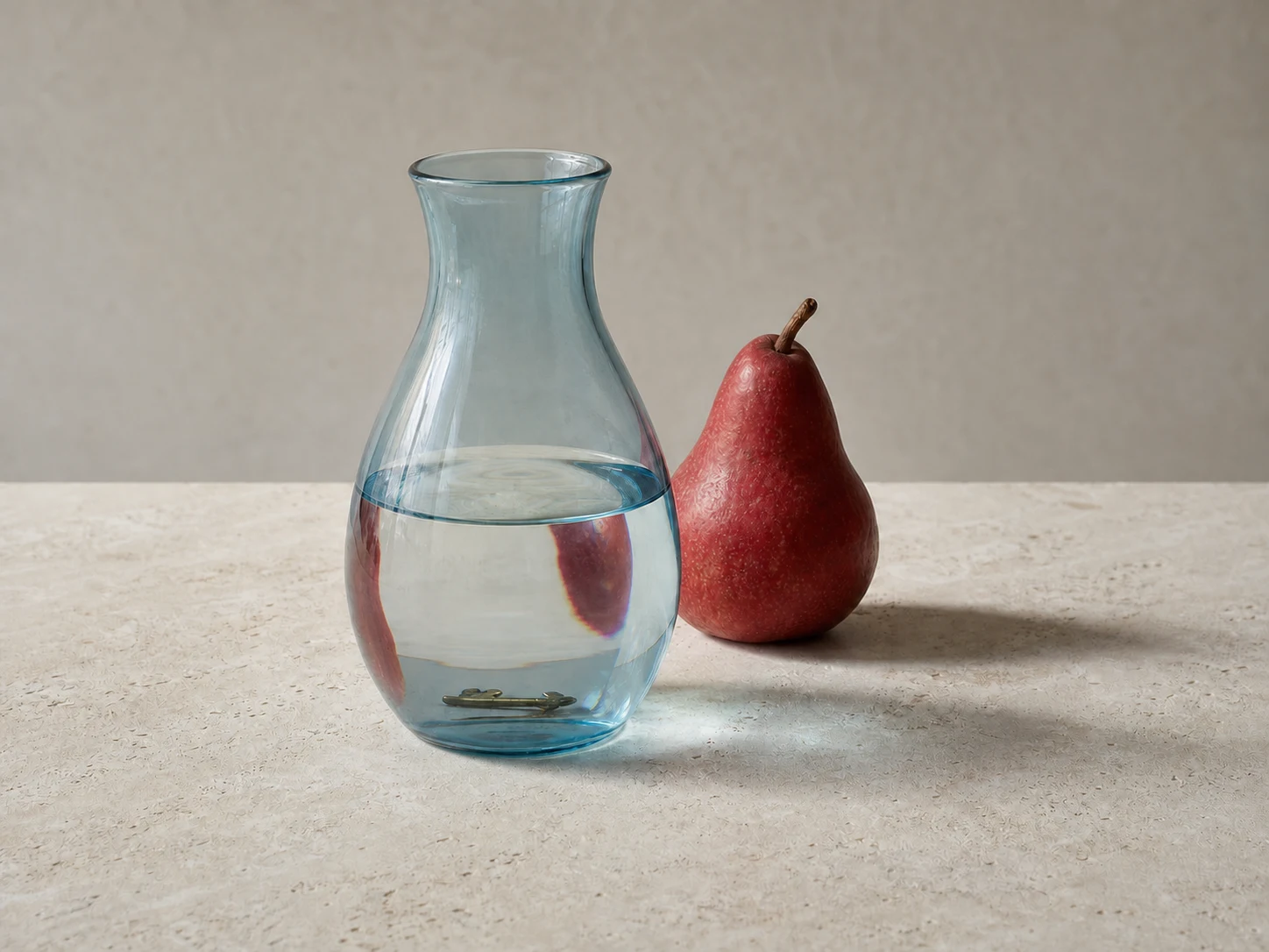
This prompt turns a vague beauty contest into a checklist: three objects, one key, a defined relationship, and a visible refraction. It directly tests the detail-versus-meaning tension in the X discussion.
Qwen Image 3.0 vs Qwen Image 2 User Testimonials and Social Proof
The useful social proof is specific, not breathless:
- @teortaxesTex saw better detail but questioned whether the composition made sense.
- @codeRunnerUK found 3 slower, yet materially better for realism and effects such as liquid metal, and wanted a locally runnable version.
- @Whoknowwwww called the jump from 2 substantial in Chinese prompts and considered the free-use result “good enough,” while still preferring GPT-Image-2 on several visual qualities.
- @chuyouqi ranked a reference-sheet test with GPT-Image-2 first, Qwen Image 3.0 second, and Qwen Image 2 behind the middle group.
- @lustforbiscuits posted a left/right same-prompt comparison and judged 3 to be around the Nano Banana tier.
- @imboomu observed that 3.0 Pro was much better than 2.0 Pro but took roughly 20% longer.
These accounts do not establish a universal leaderboard. They do establish a practical community consensus: version 3 is a meaningful generation change, and its remaining complaints concern latency, access, typography taste, and semantic reliability.
Qwen Image 3.0 vs Qwen Image 2: Which Version Should You Use?
Choose Qwen Image 3.0 for Chinese posters, dense infographics, realistic material studies, long structured prompts, and reference sheets where missed instructions cost time. Choose Qwen Image 2 when a fast local or existing workflow matters more than the last increment of detail, or when you are producing rough concepts that will be rebuilt manually.
For production, keep both if access allows it. Draft quickly in 2, then send only the selected concepts through 3 with a stricter text inventory and semantic checklist. If you can use only one, the X evidence makes 3 the safer default. Just keep counting the keys.
Qwen Image 3.0 vs Qwen Image 2 FAQ
Does Qwen Image 3.0 fix every Qwen Image 2 problem?
No. The supplied comparisons show better detail, text, Chinese layouts, and instruction following. They also show that composition and physical logic can still fail.
Is Qwen Image 3.0 worth the slower generation?
For text-heavy or production-like graphics, probably. For thumbnail ideation, the reported speed penalty may cost more than the extra detail saves. Measure your own median latency over at least ten first outputs.
Can these generated illustrations prove which Qwen version wins?
No. They are prompt targets created for this guide. Use the copied prompts in both Qwen versions and keep your own first-output pairs. The X links above are the evidence used for the article’s comparison claims.
What is the single best Qwen Image 3.0 vs Qwen Image 2 test?
Use a short Chinese poster with four exact strings and one countable glass object. It tests instruction following, typography, layout, material detail, and unwanted extras without becoming impossible to score.